

How To Create A Prioritization Matrix In Excel
PICK Charts for Risk/Reward Assessments
Most decisions boil down to an assessment of risks and rewards. For example, anyone who has invested in mutual funds or bonds knows that each investment is rated according to their expected level of return versus the risk of the loss of the principal invested. The same decision-making analysis is used in project portfolio management in selecting and prioritizing projects along the risk/reward continuum.
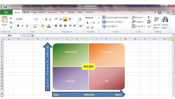
A PICK chart is used to rank projects considering their level of difficulty (the risk of committing valuable resources) and the level of payoff (the reward). The quadrants of the PICK matrix reflect the four dominant risk/reward scenarios.
P****ossible (Lower Left Quadrant) - Easy to execute, but with a low payoff, which in business language means take if nothing better comes along.
Implement (Upper Left Quadrant) - Easy to execute with a high payoff. In other words, grab this one fast before it gets away.
C****hallenge (Upper Right Quadrant) - Difficult or (challenging) to execute but with a high rewards payoff. These projects are for individuals who get their job satisfaction from seeing their "hard work payoff."
K****ill (Lower Right Quadrant) - Hard to execute with a low payoff. The only question left on this one is where is the trash can?
Steps to Create a PICK Chart in Excel
MS Excel 2010 already has templates to create a four quadrant matrix, which will save you a lot of time in your initial setup of a PICK chart. To create a PICK chart in the Excel 2003, the user needed to start from scratch by formatting groups of cells to create the appearance of the matrix.
Inserting the Matrix
Select the Insert Tab on the ribbon and then choose SmartArt.
Click on Matrix and select the Titled Matrix and this standard matrix will appear.
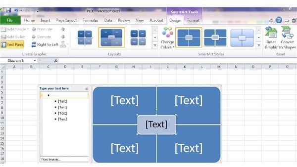
Labeling the Matrix
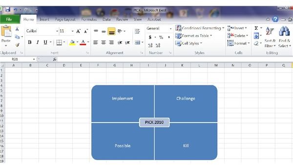
Label each quadrant clockwise as follows: Challenge, Kill, Possible, and Implement by typing the names in the left hand box.
Label the overlap area as PICK + Year, which will serve as the title of your matrix. You can adjust the size of the matrix and text labels by expanding and shrinking the size of the matrix manually.
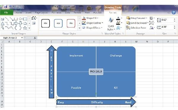
Creating and Labeling the X and Y Ax****es
The next step to create the PICK chart is to design and label the X axis for the degree of difficulty and the Y axis for the level of payoff by selecting the Insert Tab, then Shapes, and then click on Block Arrow Up for the Y Axis and Block Right Arrow for the X axis. Then drag the arrow along the cells. You can use your cursor to adjust the size of your arrows.
After you have dragged the arrow to the last cell, the Drawing Tools Format Tab with appear automatically on the ribbon. Here you can also adjust the Height and Width and add other features such as Shape Fill and Outline Features. In the example PICK chart, the arrows are blue-filled with a black outline and a width of .62 inches. The X axis arrow has a length of 4.98 inches and the Y axis has a height of 3.3 inches.
To enter text, click inside the Arrow and begin typing using the Enter or Space bars to create spacing between words. The type in the example PICK chart uses the font Calibri 14 point, bold, centered. You now have your labeled PICK matrix.
Selecting a Color Scheme for the PICK Matrix
The final step to create the PICK chart is to choose a color scheme. You can choose from either the preset multi-colored matrices or create your own using different colors and gradients by right clicking on each quadrant and selecting Format Shape and FIll Feature.
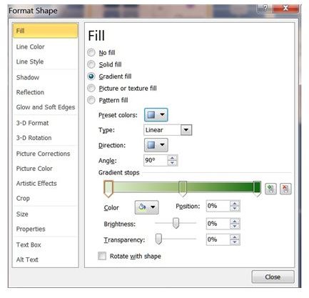
The example PICK matrix uses the preset green color gradient for the Implement quadrant and then adjusts the color for the rest of the quadrants.
To change the color, click on each of the three Gradient Stops in the bar and then select the desired color using 60%, 40%, and 25% shading respectively.
To reflect the conviction of the decision, click on the Direction in the Fill Feature, and for each quadrant select the choice that has the darkest shading in the corner that has the most payout and will be the easiest to execute.
You can also change the fill color of your title with a right click and then choosing a Fill Color.
The results should look similar to this design.
Placing Projects within the PICK Chart
To place projects within the PICK chart, first create a text box for each project.
Select Insert Tab and then Text Boxes on the ribbon and insert a text box in a cell outside the PICK chart. Choose No Fill and No Line Color and set the font to Calibri 14 point, bold and then type the name of the project.
Move each text box to its risk/return location based upon your assessment until you have placed all of your competing projects.
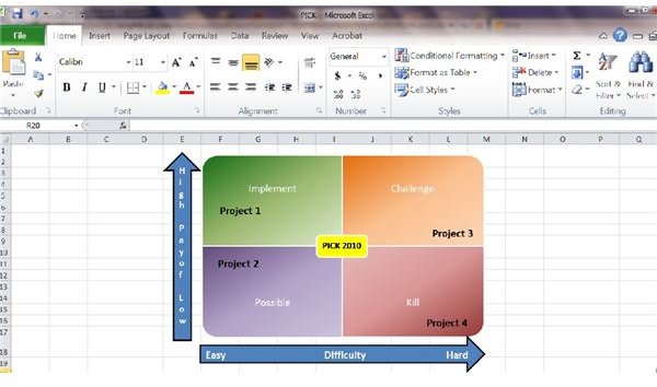
From the example PICK chart, a project manager exercising his or her role as a planner can easily see the superiority of Project 1 and the inferiority of Project 4, but may need to further assess Project 2 and Project 3 which are comparable but differ slightly on the commitment of resources and the project's rewards.
Now that you know the fundamentals how to create a PICK chart in Excel, you can begin prioritizing your projects. You can also download the example PICK chart from the Media Gallery here and adapt it to your own use.
Screenshots taken by Ginny Edwards.
How To Create A Prioritization Matrix In Excel
Source: https://www.brighthubpm.com/templates-forms/82445-how-to-create-a-pick-chart-in-excel/
Posted by: ungerherhumbrod.blogspot.com
0 Response to "How To Create A Prioritization Matrix In Excel"
Post a Comment